01
Jun
2021
Wedding Color Classic Blue of 2020
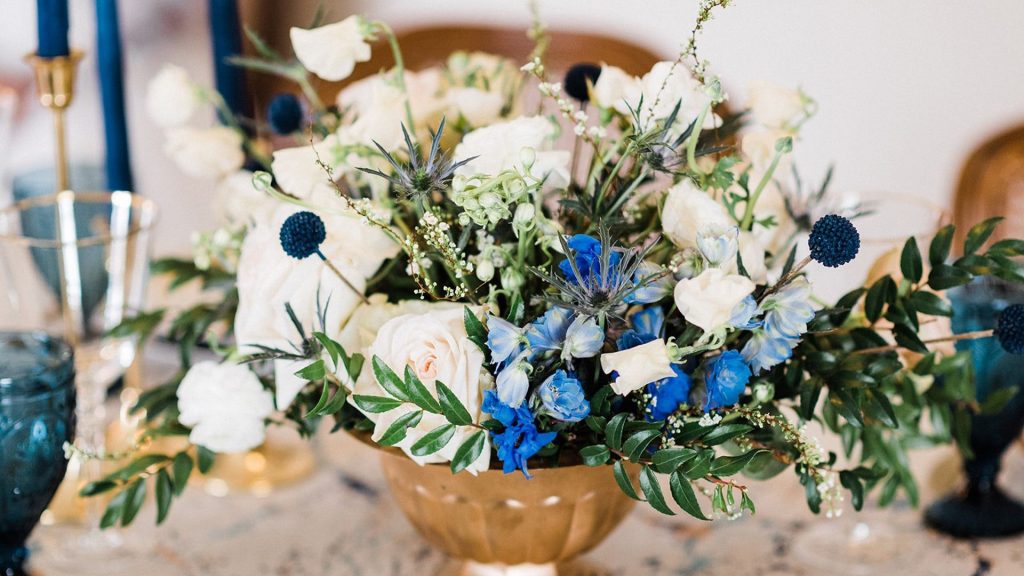
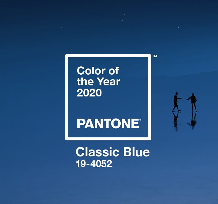
Each year, Pantone announces a color of the year that the company thinks will make a splash in various products. These colors of the year are often found on runways and on the walls of people’s kitchens and bedrooms. This is a big deal because Pantone’s color choices also shape the decisions that wedding professionals, like the design team at Design Quintessentials, make.
Forward-thinking
Pantone picks out their new hot color before the next year has even started. This means that even with all the scientific analysis Pantone engages in, there is still an element of guesswork or luck in the color designation.
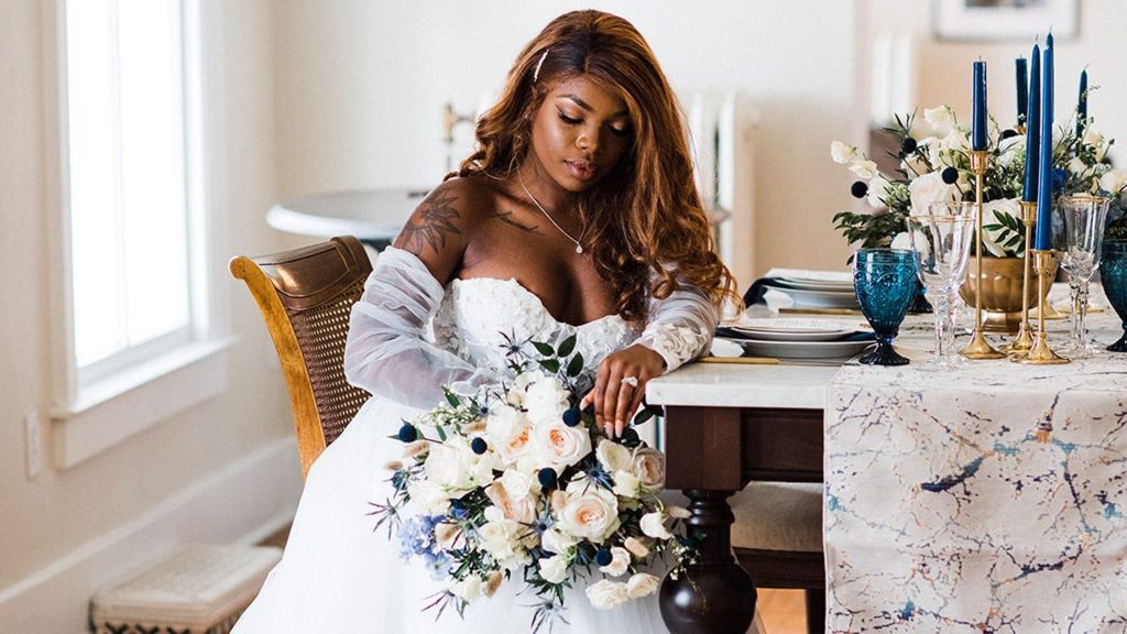
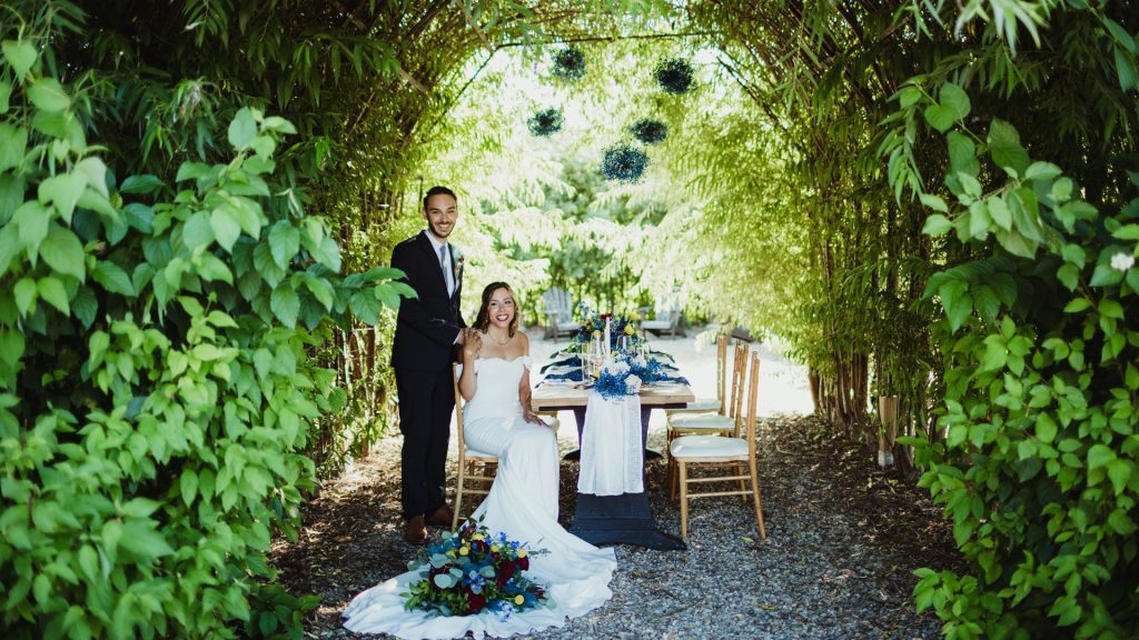
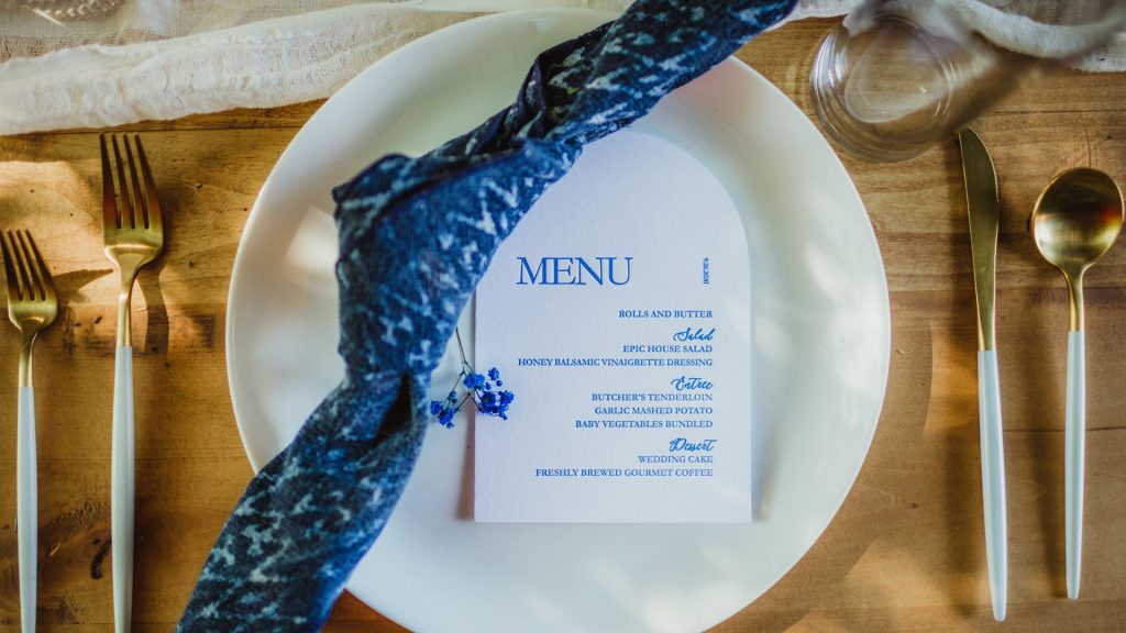
As you might’ve imagined, 2020 definitely illustrates this. The Pantone color of the year was classic blue – a color that almost everyone responds positively to. We were actually lucky enough at Design Quintessentials to be able to do several stunning wedding arrangements in this hue during the year.
But, as the year wore on and people’s pandemic fatigue increased, the blue gradually seemed like just too much. I would almost go as far as saying it was depressing and stifling. Let’s not forget that for decades in art, blue has been a color associated with melancholy and depression.
Turning The Page…
The start of 2021 gave Pantone a chance to turn the page and start over with a new star-making shade for the color of the year. So this year, Pantone decided to select two stunning colors that go together, like peanut butter and jelly.
These two colors are ultimate gray and a warm sunny yellow. Both of these colors send a clear and reassuring message to everyone who has survived the pandemic devastation of 2020. For example, the ultimate gray color sends the signal of strength and resilience. But, then, the warm sunny yellow is optimistic, suggesting that there is hope for a better future on our horizon.
What makes these selections even better is that the two colors complement each other so well. At Design Quintessentials, we are excited to see many of our brides embracing these signature colors. I also know (and embrace) that this will push my skills forward. Gray is not a color that we tend to think about when we ponder flowers.
Book A Consultation
Have a wedding coming up and need flowers that’ll be the stunning talk of the town? Contact Design Quintessentials! Plus, if you’re daring enough to incorporate this year’s color of the year, we’ll be more than thrilled to get our hands on it and bring your vision to life.
Nicole D
Ching & I first worked together on one of our clients’ weddings & she did an incredible job! From her communication to her absolutely stunning florals! Afterwards she reached out to me to do a styled shoot together! She worked on getting fabulous new local wedding vendors to our venue, The Roostertail. Organizing a styled shoot takes more than most people realize but she handled everything in a professional and friendly manner! Since then I have personally reached out to her paper invitation company for two different projects!"
"Thank you Ching for all your hard work when working together!
Featured entries
Immerse yourself in a showcase of cohesive stationery and floral masterpieces.
Unlike one-size-fits-all approaches, we invest the time needed to craft personalized designs that reflect the uniqueness of each couple, making the journey with us truly special. We're not about quick templates or trends – we're here for brides seeking a personalized and trusting design experience, navigating away from indecision and universality. Let us transform your wedding day into a celebration that is unmistakably you.
